| Image |
Comment |
| 08/11/2004 03:20:01 AM |
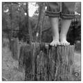
On the Stump!by Firstrich1Comment: It is election season after all. I like the black and white ... I wonder if you considered removing the eyebolt -- it's the only thing not animal or vegetable in the picture and kind of "sticks out" because of that, and because it's sticking out : )
I Like the tone range and detail. |
 Photographer found comment helpful. Photographer found comment helpful. |
| 08/10/2004 09:01:46 AM |
"POP !" a macro illusion by graphicfunkComment: Originally posted by jmsetzler:
Greetings...
This is a beautiful execution... congrats :)
I listened to a discussion once about a technique for this type of photo where the bottom of the bottle is removed... the bottle is mounted and water is poured in from the open bottom of the bottle... is this similar to a technique you may have used for this? |
Or, after cutting off the bottom of the bottle, you can squirt water through the opening with a hose. Might be interesting to have a shot where the cork "pops" five or ten feet. |
| Photographer found comment helpful. |
| 08/10/2004 12:01:36 AM |
Fireworks Montageby annasenseComment: With those 12 shots you could have the makings of a nice calendar, perhaps with this montage as the front or back cover, or as the top half of a single-pager with this on top and the calendar on the lower half. A 12 x 18 print is only about $4 and would be a good size for a small office wall calendar.
I'd personally get overly clever, with tiny fireworks pics on the holidays and such, but it can be done quite simply also : ) |
| Photographer found comment helpful. |
| 08/09/2004 12:18:44 PM |
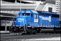
Conrail 3347...One of the few Blues Leftby OneSweetSinComment: Originally posted by melismatica:
... I don't think the selective desat is working hard enough to create an 'invisible' background. This is because, in spite of the gray tones, there is still quite a bit of business created by the various lines and blocks of shape. There are the v-shaped diagonals created by the roof of the depot, more diagonals in the ramp-like structure that appears just above the train, the curved lines that radiate across the roof of the foremost structure, and the 'box' of stripes created by the structure that is above the ramp-like structure. All this suggest to me that the DOF is simply to deep, creating a flatness to the entire viewing plane. There is no distance between the train, the foremost building, and the highrise which logic tells me is in the distance but which my eyes tell me is in the same space as the train. |
You might try to create this effect by creating a mask for everything above the rails and applying some Gaussian Blur. |
| Photographer found comment helpful. |
| 08/09/2004 12:14:53 PM |
Peppercorn Blendby OneSweetSinComment: I really like the crinkly texture; reminds me a little of a photo I did of some lychees. I think the brightest highlights on the white peppercorns are just a little TOO bright (for me); I had a couple of similar spots on my own Macro entry and finally went back and just barely touched them with the burn tool, and it seemed to help.
Given the emphasis on the texture of the individual peppercorns, but the overall amorphous arrangement (unlike some previously-seen yin/yang presentations), I think there may be something vaguely disturbing about the portrait orientation. I probably would have cropped to a square, but I suspect you may have gotten a small bump in your score just by putting it on its side.
I also want to get cute and re-title it Peppercorn Salad : ) |
| Photographer found comment helpful. |
| 08/08/2004 08:26:30 PM |
|
| Photographer found comment helpful. |
| 08/08/2004 08:24:19 PM |
|
| 08/08/2004 02:10:24 PM |
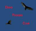
The Dead Pickers Clubby Dim7Comment: First off I like the "pun" in the title!
I do do graphic design : )
I agree, the type color does not work that well with the sky color. If you really want the blood-red in the type, then I'd try one of these workarounds:
--create a mask and lighten the blue tones of the sky without changing the birds
--use either a black or white drop-shadow under the type
--change the type to black or white, with a red drop-shadow |
| 08/01/2004 10:23:06 PM |
Now THAT's What I Call a Balanced Diet!by GeneralEComment: Originally posted by Spanish_Grease:
Overall, I think your idea had merit. It was a bit of stretch to fit the challenge, but it did so in a humorous way. Knowing your work GeneralE, it seems like you were a bit rushed putting this together and couldn't put everything into it.
Lee |
I think you summed it up nicely! |
| 08/01/2004 06:42:57 PM |
|
| Photographer found comment helpful. |
Home -
Challenges -
Community -
League -
Photos -
Cameras -
Lenses -
Learn -
Help -
Terms of Use -
Privacy -
Top ^
DPChallenge, and website content and design, Copyright © 2001-2026 Challenging Technologies, LLC.
All digital photo copyrights belong to the photographers and may not be used without permission.
Current Server Time: 07/07/2026 10:47:07 AM EDT.